Posts

Final Portfolio

Image
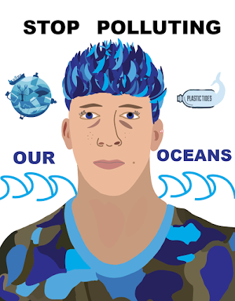
  Artist Statement:      This portfolio seen above represents all of the projects and assignments required for the FMX 210 Digital Media course. This portfolio was created in Abode InDesign, The assignment was to incorporate all or the major projects within this course into one project. The idea of each project was the create a design from scratch with a representation of myself within each design.      Going into the FMX 210 course, I had no prior experiencen with any of the softwares used. All of then different options and layouts made it pretty difficult to  jump into, however, with each new project assigned, I became more and more comfortable with the softwares. The business card assignment definitely gave me some experience and because of the things I learned from creating them, I was not too worried about using InDesign to construct my final portfolio.I chose a font that I that stood out of the most and make all the titles as symmetrical as possible. I decided to make the section

Business Cards

Image
Business Card #1 Business Card #2 Business Card #3 Artist Statement:               I really like how my three business cards turned out. On the first business card and the second side of the second business card, there is a white background so it is a little hard to determine where it ends but you get the idea. I spent around 4 hours completing these cards because of the different layouts and fonts I used to create the 3 cards. I wanted it to look very good so I changed the layouts and backgrounds and all that multiple times until I thought it looked perfect.          For the first card, I used my blue and green logo with a black background. I wanted it to look interesting so I split up the background to show a white line filler in between the two black parts. For the back of the card, I used the black background again to match the front and then I wrote my name with the same blue color I  incorporated in the anchor of my logo. I then used the same color for the information text (numbe

Autoscopy

Image
  Autoscopy Original Image Inspirational Images Artist Statement     For this project, it took me a long time to complete. I started by using a completely different photo and created an entire autoscopy based off of that photo. I will insert the photo below:       After I completed this, I did not like to final result at all. I thought it looked very unprofessional and seemed like I just randomly placed a bunch of items in. So, I decided to start over. I looked for other original images and found a picture of me on a cliff in Newport, Rhode Island that I absolutely loved and decided to create a new autoscopy based on this image.     When I first started altering the image, I decided I wanted to put a beautiful space background that would replace the sky.   I recently discovered that I am extremely intrigued by space, something I never thought deeper into before. After reading up on UFO sitings and Area 51 and all that, I became very interested. I found a very pleasing photo, and placed

BW to Color

Image
Original Photo Analogous Photo Triad Photo Complementary Photo Artist Statement         For this assignment, I first looked through my photo gallery to find interesting photos of me in order to create designs on. I looked through a few, but came across an old photo of myself doing a backflip off of my car in the sand dunes in Rhode Island. I figured I would use an interesting and cool looking photo to change the colors on so that I do not get bored while making it and to make it more interesting to look at from the audiences perspective.      I started off by choosing the analogous color rule for my first version. I played around with the colors and landed on a purple and blue color way. I started by selecting different parts of the car on the left to change the colors rather than selecting the whole car which I thought would look like one big blend. I played around with the colors and opacity's until it looked just like how I wanted it to. I then went to my actual body. I started

Pixels Tagbrush

Image
Original Logo Logo Tag Brush Logo Tag Imprint  Artist Statement:     When I was making the logo tag brush, I was a little skeptical about how it would turn out. I wasn't sure if the outline around my logo would look good considering that the lines are not exactly symmetrical. After realizing that the smudges and uneven dots and lines are supposed to look how they are, I felt a little better about creating the tag brush.     I thought it was fairly easy to create the tag brush after instructions given by our professor. I wanted my design to look a little faded and glitchy rather than clean and symmetrical. The end result looks as if someone spray painted something a while ago and the paint faded over time. This is exactly what I was going for. I played around with a bunch of different colors before settling on the brownish, orange/red color. I started off with bright colors like neon green and blue, however, I felt like these colors did not portray a faded and weathered look. I deci

Propaganda Poster

Image
 Propaganda Poster Original Self-Portrait Artist Statement:      For my propaganda poster, I decided to pick a topic that has been an on-going issue in my home state as well as all around the world. Ocean pollution has been rapidly increasing, killing large amounts of marine life. I really started to notice the abundance of trash in our oceans when I went home this past summer. I was swimming in the ocean and noticed an immense amount of plastic water bottles and bags floating around me. This made me very upset considering how much the ocean means to me. Growing up in Rhode Island, I was surrounding by beaches and the ocean. I would swim and surf almost everyday, and seeing the way people treat the ocean makes me want to do whatever I can to stop this from getting worse.      Rhode Island is a big tourist location because of the beautiful beaches surrounding the state. If ocean pollution continues to increase in that area, no one will want to visit. This will make ocean lovers, such as

Logos

Image
  Logos     Above is the finished version of my colored logos design. For this assignment, I thought of my hobbies and interests, just like the other projects I've completed for this class. Obviously, the ocean and surfing are the biggest things that keep me going in life. First, I thought of  incorporating a surfboard into my logo, but I did that for the calligram design so I figured I would steer in a different direction for this design. I am from Rhode Island, a state that I absolutely love considering how happy I am when I am home. An anchor is a big symbol for my home, which means it is a big symbol for me as well. It symbolizes hope, something that I live by everyday. There is always hope that something amazing will happen. I added in some waves as well to give it more detail and to really put an emphasis on my love of the ocean. This logo has a lot of meaning to me, so I think that it really works as my personal logo.      For this assignment, I used the rectangle tool, the