BW to Color
Original Photo

Analogous Photo

Triad Photo

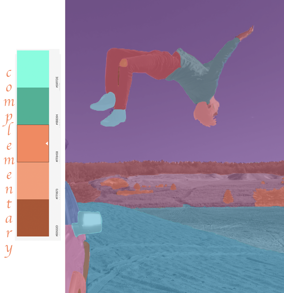
Complementary Photo
Artist Statement
For this assignment, I first looked through my photo gallery to find interesting photos of me in order to create designs on. I looked through a few, but came across an old photo of myself doing a backflip off of my car in the sand dunes in Rhode Island. I figured I would use an interesting and cool looking photo to change the colors on so that I do not get bored while making it and to make it more interesting to look at from the audiences perspective.
I started off by choosing the analogous color rule for my first version. I played around with the colors and landed on a purple and blue color way. I started by selecting different parts of the car on the left to change the colors rather than selecting the whole car which I thought would look like one big blend. I played around with the colors and opacity's until it looked just like how I wanted it to. I then went to my actual body. I started off with the shoes, then went to the pants, the shirt, my hair, my face and my hand. I changed the colors a lot and used low opacity's to make sure that the the details on my pants and shirt stood out with the colors over it. I selected the mask and used the brush tool to get clear and concise lines to separate the clothing. Then I went on to the background of the photo. I changed the sky first and picked a bluer color and lowered the opacity. I then selected the land in different increments just like I did with the car to make the different elevations stand out. I selected low opacity once again to make sure the detail in the sand was visible. I chose to make all of the trees and bushes the same color to look more organized and did the same thing with the opacity to emphasize on the details. Lastly, (which I forgot to do at first) I changed the color of the hole in my jeans at the knee to show that it is not part of my pants. I selected the area in between my two legs with the hole in my jeans as well to make sure the pant legs did not blend together. I think this turned out very good but wanted to use different colors to make it brighter and stand out more for the next version.
For the triad color rule, I chose different colors to ensure nothing blends in with each other. I used the same selections that I used for the analogous photo and played around with the different colors and opacity's until I thought it looked good. I decided to make the bushes a different color than the trees in the very back to show that they are closer and to make them stand out even more. I picked a bright yellow for the fender on my car to make that stand out even more as well. I like looking at this one the most because
I really liked how it turned out.
For the last color rule, I used the complementary option. This is my favorite version because I love how colors turned out in my body the most. I selected a higher opacity for my shoes to make the look more like a cartoon. I wanted my face and hair to have similar colors in this photo to make it different than the other 2 as well. I think that these colors are very appealing and they make the details in the photo all stand out.
This took me around 3 and a half hours to complete. I decided to put the color boxes on the left instead of the top or bottom because the photo was already pretty narrow. I choose an interesting font to label the photos and picked colors that I liked the most out of the colors on the color rule. Overall, I think they all turned out pretty well. This most trouble I had was on the second photo. I could not figure out how to select the masks that I already made and change the colors for the different color rule. After watching the video, I learned that all I needed to do with hit option and then select the mask, use the magic wand, click inverse to select the white rather than the black, and then change the solid color to the color I wanted. I am very happy with how it turned out and after learning about it last class and watching your tutorial, it was not too difficult to complete.

You did a great job. This honestly looks like it could be an ad for O'Neill or RVCA. My favorite version is the second triad color pallette. The vibrant colors on you body stand out well against the muted colors in the background. I also like the complementary pallete because it almost looks like an infared scanner.
ReplyDeleteI really like the colors you used on this project, my favorite also being the triad. The colors are all so different from each other so it makes each section pop as much as the other.
ReplyDeleteThese pieces turned out so cool. The composition of the picture you chose made the color edits look so satisfying. This would be really cool as a collection of edits.
ReplyDeleteThese all came out so good. I like the specific picture you choose to edit because it is so different then everyone else. I love the triad color palette since all of the colors pop. Good job!
ReplyDelete