Pixels Tagbrush
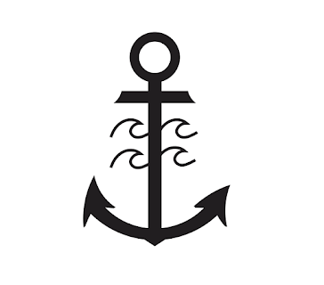
Original Logo
Logo Tag Brush
Logo Tag Imprint
Artist Statement:
When I was making the logo tag brush, I was a little skeptical about how it would turn out. I wasn't sure if the outline around my logo would look good considering that the lines are not exactly symmetrical. After realizing that the smudges and uneven dots and lines are supposed to look how they are, I felt a little better about creating the tag brush.
I thought it was fairly easy to create the tag brush after instructions given by our professor. I wanted my design to look a little faded and glitchy rather than clean and symmetrical. The end result looks as if someone spray painted something a while ago and the paint faded over time. This is exactly what I was going for. I played around with a bunch of different colors before settling on the brownish, orange/red color. I started off with bright colors like neon green and blue, however, I felt like these colors did not portray a faded and weathered look. I decided to go with this color because it is clearly not a fresh looking color which is a change from the colors I've used in other projects in this class.
Overall, I think that my final design turned out very good. I am very pleased with the logo I made (see the logo blog post I did regarding all aspects of the logo) and I feel like the blurry line with the scattered paint drops makes the design look very natural. The tools we used were easy to work with and did not take a lot of practice to create the design I envisioned.


I really like your logo, and I think your black and white tag brush looks great.
ReplyDelete