Logos
Logos
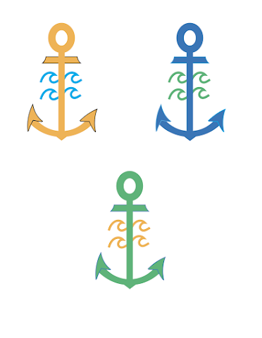
Above is the finished version of my colored logos design. For this assignment, I thought of my hobbies and interests, just like the other projects I've completed for this class. Obviously, the ocean and surfing are the biggest things that keep me going in life. First, I thought of incorporating a surfboard into my logo, but I did that for the calligram design so I figured I would steer in a different direction for this design. I am from Rhode Island, a state that I absolutely love considering how happy I am when I am home. An anchor is a big symbol for my home, which means it is a big symbol for me as well. It symbolizes hope, something that I live by everyday. There is always hope that something amazing will happen. I added in some waves as well to give it more detail and to really put an emphasis on my love of the ocean. This logo has a lot of meaning to me, so I think that it really works as my personal logo.
For this assignment, I used the rectangle tool, the ellipse tool, and the star tool to create the anchor. I put it all where I wanted, and used the warp tool under effects to warp it into the shapes on an anchor. I used the bend tool to create the piece right below the circle and the arc tool to create the ends on the bottom of the anchor. I created one pointy end, then reflected it to create a similar one on the other side. I also used the arc tool to create the curve at the bottom where the two pointy pieces are connected to. For the waves, I used the curvature tool and then copy and pasted it four times to make it symmetrical.
When I was thinking about which colors to incorporate, I thought of an orange/yellow as a depiction of the sun to represent happiness. I used two different shades of blue to symbolize the ocean and how it changes colors according to the seasons. I used green to show that I am just as happy on land than when I am in the ocean in Rhode Island. Everything about the state makes me content. I threw in some strokes as well for more detail.
I think that this logo came out just as I envisioned it. This was a lot easier for me than the previous projects because I have more experience with adobe illustrator. These projects are making me feel very comfortable with this software which will definitely help me in the future.
BW Logo


I like the simplicity of the logo yet it is straight to the point and you can see it from far away.
ReplyDeleteI can clearly tell a lot about you by looking at this logo. Very symbolic.
ReplyDelete