Propaganda Poster
Propaganda Poster
Original Self-Portrait
Artist Statement:
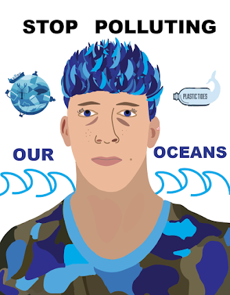
For my propaganda poster, I decided to pick a topic that has been an on-going issue in my home state as well as all around the world. Ocean pollution has been rapidly increasing, killing large amounts of marine life. I really started to notice the abundance of trash in our oceans when I went home this past summer. I was swimming in the ocean and noticed an immense amount of plastic water bottles and bags floating around me. This made me very upset considering how much the ocean means to me. Growing up in Rhode Island, I was surrounding by beaches and the ocean. I would swim and surf almost everyday, and seeing the way people treat the ocean makes me want to do whatever I can to stop this from getting worse.
Rhode Island is a big tourist location because of the beautiful beaches surrounding the state. If ocean pollution continues to increase in that area, no one will want to visit. This will make ocean lovers, such as myself, not want to enjoy it as well. There are several organizations working towards fixing this problem, including 4ocean. People need to be aware of the harmfulness that comes out of throwing trash into the ocean, for human sake as well as marine life.
After I created my portrait on illustrator, I thought about how I could incorporate my message into it. I decided to change the color of my hair to a bunch of different shades of blue to represent the ocean and its color changes throughout the year. I then worked on throwing some shades of blue into my green camouflage shirt to match my hair and put an emphasis on the ocean. I left some shades of green in my shirt as well to stress the importance of eliminating pollution on land as well as in the ocean. Pollution on land is just as harmful as ocean pollution. I then picked the right font to make the message stand out and wrote "stop polluting our oceans" in capital letters. I put the first two words in a large font size in black and then the last 2 words in a blue to match some of the colors in my hair and my shirt. I was going to stop there, but I figured adding more details would draw an audience in more than just leaving it how it was. I added some ocean pollution logos on both sides of my head for detail and symmetrical purposes. I think the "plastic tides" logo with a dolphin as a water bottle will generate some sympathy for the animals suffering from human action. Lastly, I added some waves using the curvature tool to put even more emphasize on the ocean that I think will catch people's eye and motivate them to change. After playing around with different gradients and color for the background, I decided to just leave it white because in my opinion, it makes the message stand out more and look more organized.
Overall, I think my poster turned out very organized and professional and hope that it motivates people to stop polluting our oceans. Our oceans cover about 71 percent of our earth, and we really need to take care of them.


Hey Sean,
ReplyDeleteI really like how this is straight to the point with the message. It's an important message and there's not a lot of distractions from receiving that message appropriately. Great work!