Business Cards
Business Card #1


Business Card #2


Business Card #3


I really like how my three business cards turned out. On the first business card and the second side of the second business card, there is a white background so it is a little hard to determine where it ends but you get the idea. I spent around 4 hours completing these cards because of the different layouts and fonts I used to create the 3 cards. I wanted it to look very good so I changed the layouts and backgrounds and all that multiple times until I thought it looked perfect.
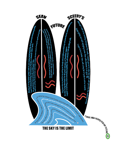
For the first card, I used my blue and green logo with a black background. I wanted it to look interesting so I split up the background to show a white line filler in between the two black parts. For the back of the card, I used the black background again to match the front and then I wrote my name with the same blue color I incorporated in the anchor of my logo. I then used the same color for the information text (number, email) as the waves from the logo to make it more organized as well. I then used the pen tool to create the art section of the card. I wanted the waves to match the waves on my logo to add even more detail to the card. I used bold fonts the make the text stand out. I think it turned out very pleasing and professional.
For the second card, I used my golden anchor. I played around with the background until I came across the black portion in the middle to make the logo stand out and the same color blue on either side. For the back of it, I placed the background and the text until I thought it looked symmetrical. For the text of my name, I used a black text with the same blue as the blue on my logo to surround the text. I think it makes it pop out and look very good. I then used the same color as the anchor to write the information to make it match as well. I think this one looks very organized.
For the final business card, I wanted to change it up so I used a vertical version rather than a horizontal version. I started by placing my third colored logo in the middle of the card, making it symmetrical. I then thought about the background and decided to use a gradient to make it different than the rest. I choose a blue gradient to match the outline of the anchor and to put an emphasis on the ocean considering that is the overall theme of the cards. For the back, I placed all the text and the logo in the center to make it symmetrical. I started with different colors for the text but I just ended up making it black because the text was hard to see with the other colors. Finally, I used the same pen tool to create the waves on the right side to add more detail. This card is my favorite out of all of them.
I think the length that it took me to complete the cards gave me the experience I needed to make professional and appealing business cards.


Comments
Post a Comment